|
Okay, okay... I’ll spill! I’m excited to share with you that I’m working towards obtaining my Construction Supervisor License in Massachusetts!!!!
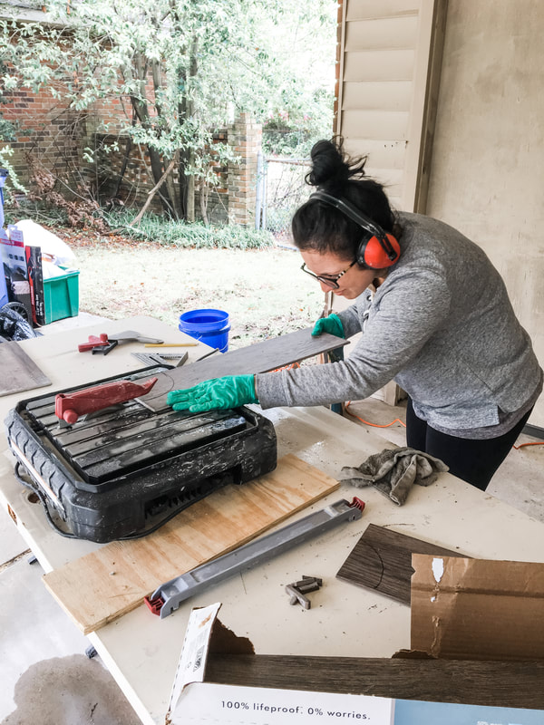
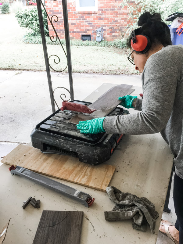
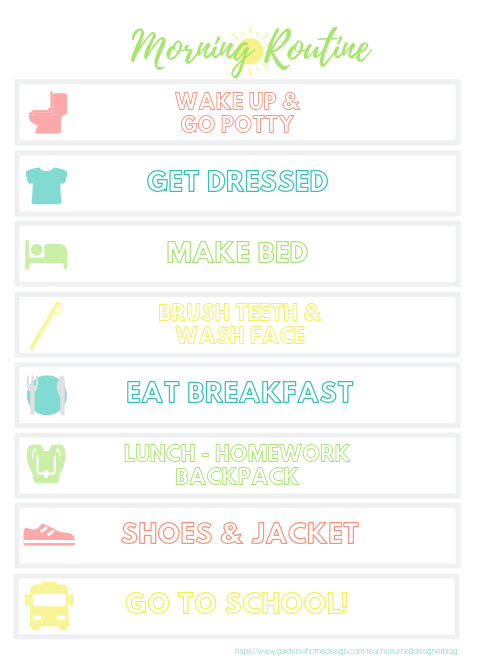
I’m in the process of navigating all the material (oh, the stacks of books) and preparing for the test. Thanks to an amazing friend who encouraged me and is taking the CSL course with me, I’m excited to get this license so I can grow and broaden Shea Interiors in the direction I’ve always hoped to. Bottom line, I’ll be able to help more folks in their homes in bigger and better ways having the all knowledge necessary in construction and design. I’ve always been intrigued by building and construction as I grew up in the industry working alongside my dad, a contractor. My husband and I started our own DIY journey by researching how-to videos on YouTube years ago as well as a Home Depot How-To book in hand when we bought our home over 11 years back. We’ve renovated bathrooms, replaced flooring, installed tile, trim and so much more in our little fixer upper home. I’ve learned so much about construction over the years and am excited to finally make it official with a CSL license. Thanks for the love and inquiries wanting to know the big news!! Off I go to dive into some more studying. I’ll leave you with this photo evidence that I do in fact know how to operate a tile cutter. Happy weekend, friends! Welcome to The Blog at Shea Interiors (formerly Gardenia Home Design). A new name in a new year with new goals and tons of hope for the months ahead. It’s been a wild ride, 2020. Thanks for all the lessons. Moving into the new year slowly and steadily, I’m reminded that 3 years ago I started my little business in mid January 2018 while I was still teaching elementary students. A few years later, I’m proud (and surprised) when I look back at what I’ve accomplished and what I’ve learned along the way. Personally, I’ve had a rocky 2020 with health issues including several surgeries too. Now that I’m healed and healthy, it really felt like the right time for a business reboot. We all need a fresh start sometimes, right? Changing the name to Shea Interiors to reflect the new “2021 me” felt like the right way to kick off the new year and celebrate 3 years in business. Though I’ve got a new look and new name, my mission remains the same: creating peaceful and fresh interior spaces perfectly reflective of the home-owners. 3 years and many projects later: here’s a peek at some of my first projects in the early days. Welcome back to the blog! It’s been a busy summer here! So much family fun...and I’m exhausted. My boys are heading back to school on Tuesday and I’m excited for them. It’s a little bittersweet for me personally as I’m in year two of full-on-business-mode and the second year I haven’t gone back to an elementary classroom. Sending hugs to all my teacher friends heading back as this is such a stressful time of year for teachers! I miss a lot of things about teaching, especially the spirit and excitement of the first few weeks but I’m super excited to see what this school year brings for my business. This summer season I’ve been working with several new design clients. Between complete remodels and redesigns adding all new furniture, I’ve been a busy bee. Summer has been wonderful but it’s been a challenge juggling fun-mom and business-mom however, I’ve made it out alive! Going back to school for me now means catching up on the business end of things since the kids will be back to their routine. Dozens of to-dos have been on the back burner for GHD so I’m thrilled to get back in my own little groove. We’re kicking off this school year right in my house by establishing a solid morning routine as I find school mornings are the most difficult for us. Getting out the door can be tricky and stressful but I’m hoping to make some changes that will make happy mornings like this morning routine chart my son and I created! FREE MORNING ROUTINE DOWNLOAD BELOW!
We needed to add “make the bed” and “teeth brushing” this year as they weren’t so good about that last school year. Yikes! I posted a copy for the kids (and for me) on a clipboard upstairs and downstairs and with a little parental support, they should get in the groove in no-time.
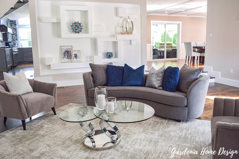
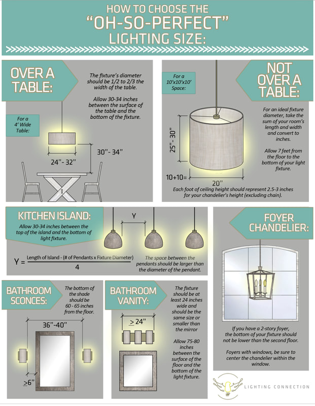
When we made this chart, my son sequenced the routines to work for him in the morning. Your child may decide to reorder these so you can easily print on cardstock, cut out the rectangles, reorder, add Velcro or magnets, and post in a visible spot. As a teacher, I know routines are difficult to establish at home (nothing like establishing a routine with 20+ kids but still hard) BUT if everyone’s on-board and parents are organized and encourage the routine as well, new habits will form. Here’s to a great school year ahead for you and the kids in your life! Far too often I see light fixtures that are too small for the space. Many times we become focused on the cost of the product (smaller fixtures are generally less expensive) that we forget to measure and consider filling the space appropriately. Here are some tips for determining the best fixture for your space. Not only is lighting an important function but it also adds to the style and feel of a space. Lighting is such a primary feature in a room so you want to be sure you get it right the first time. Let’s first dive into the 3 basic types of lighting. There are 3 Basic Lighting Types: 1. Ambient: provides overall illumination, typically in a new-build or remodel that is the recessed lighting 2. Task - illuminating for a specific function like over a sink or countertop or a lamp on a side table 3. Accent - indoors illuminates artwork or outdoors illuminates landscape (highlighting a tree) Above you’ll see the three different types of lighting. Look closely for the accent lighting in the blue and gray contemporary room.
Be sure to measure, measure, measure! If a fixture is too small it’s distracting to the eye instead of complementary to the space. Have fun and share below how your lighting projects are going! Thanks for reading and be sure to subscribe above and check out my social media links to the right as well.
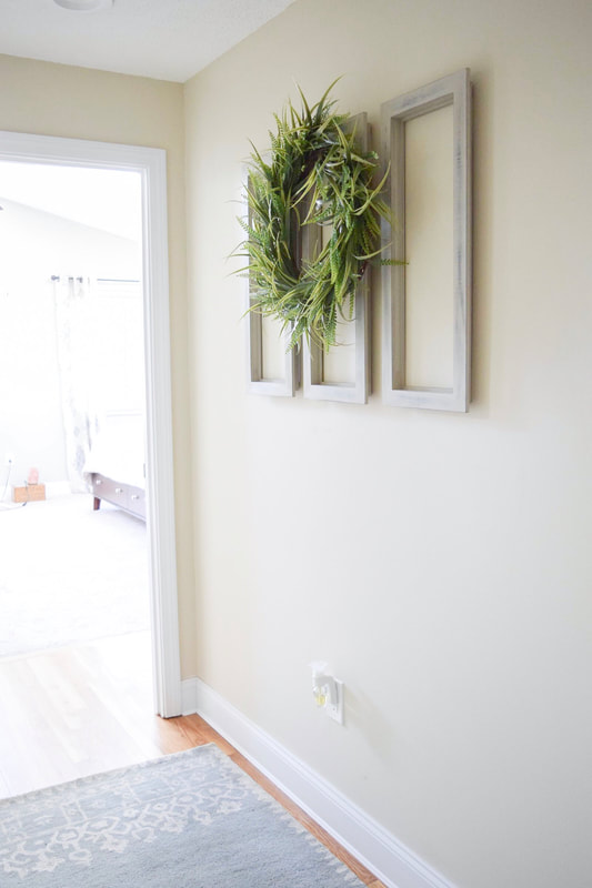
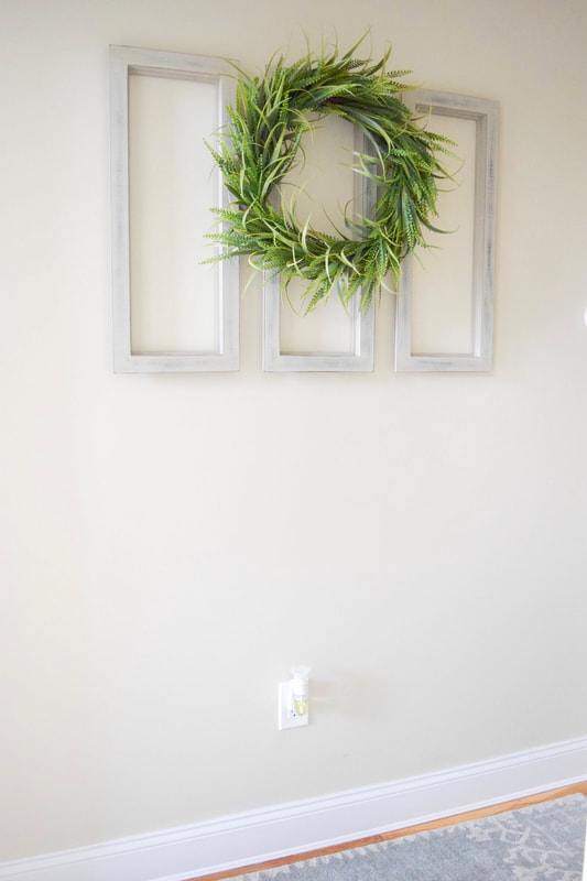
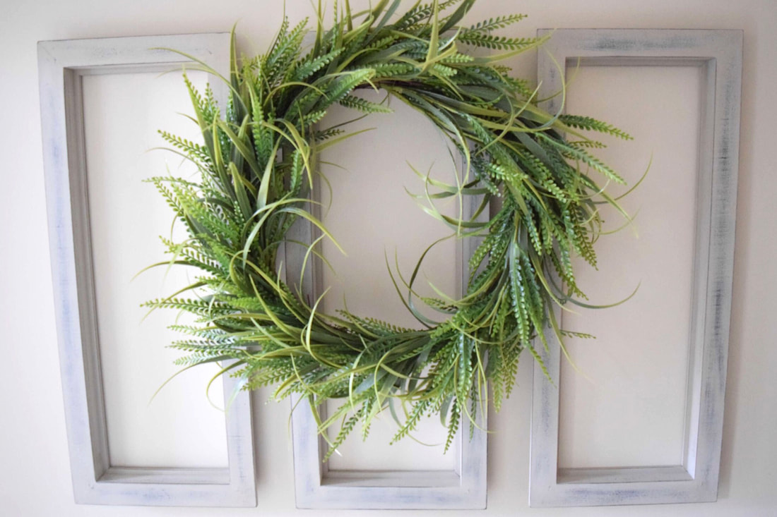
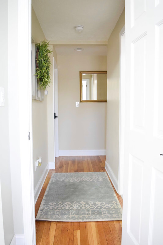
Do you have a blank wall in your hallway or entry and a small budget? This project is similar to the farmhouse window paired with a wreath that we’ve all seen on Pinterest but this look is bit more modern and fills a space well. It’s simple and easy and takes no time at all - follow along with me... You’ll Need: -1 large green wreath -3 narrow wood frames without the glass and backer -3M Command Removable Interlocking Fasteners -Floral wire For this project I recommend buying or making a large green wreath made with boxwood, fern, or magnolia. You could instead use 3 small green wreaths, one for each frame but I feel you get a more unified look when using the one wreath. Make sure your wreath is about 1.5-2x the width of one frame’s width. I found these particular decorative frames for $2.99 each at Ocean State Job Lot that inspired this project. When I saw them in store, I knew exactly what to do with them. I used these in a hallway for a client and I think it looks so sweet in this bright hallway. And what a steal for $2.99 a piece! They’re painted MDF in an off white and distressed. If you can’t find them at your local OSJL, I found a similar product here at Hobby Lobby. Take your frames and attach the Command Removable Fasteners to the back of the frames. Place the strips on the right and left sides of the back. Be sure to hang them at eye level. Eye level means to hang piece so the focal point or center point is 5 feet above the ground. Not too high, people! Use a long level and line up each frame next to the other using the center frame as a guide. Don’t worry about getting them to line up perfectly on the first try, they can always be adjusted because of those handy 3M strips you used. Thank goodness for this invention! No holes and no stress. These strips are my go to, especially when hanging a piece I may want to change out like seasonal wall decor or art in the kids rooms as they grow. Next attach your wreath to the center frame using floral wire by wrapping it around the wreath and around the top center of the middle frame. Stand back and admire! You’ve created a large gorgeous statement piece for little money (if you’re a bargain hunter like me). If you copy this look or are inspired to create something similar, have fun with this and leave me some comments and pics to let me know how it went. What DIY ideas you want to see in the future? Something for a bedroom or front porch? Comment here to let me know! Make sure to SUBSCRIBE on the right to stay in the loop! Thanks for reading!
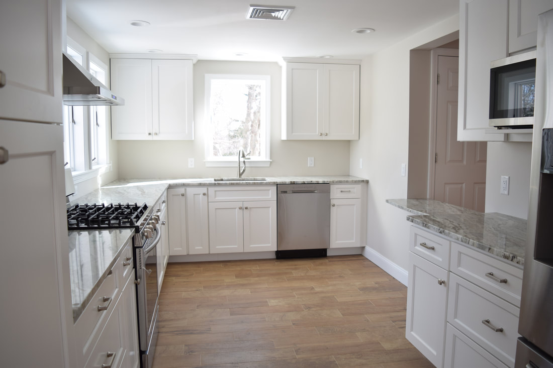
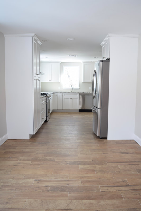
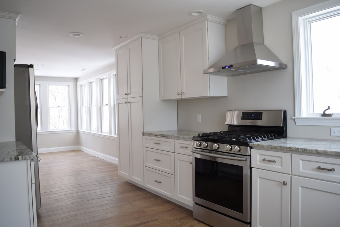
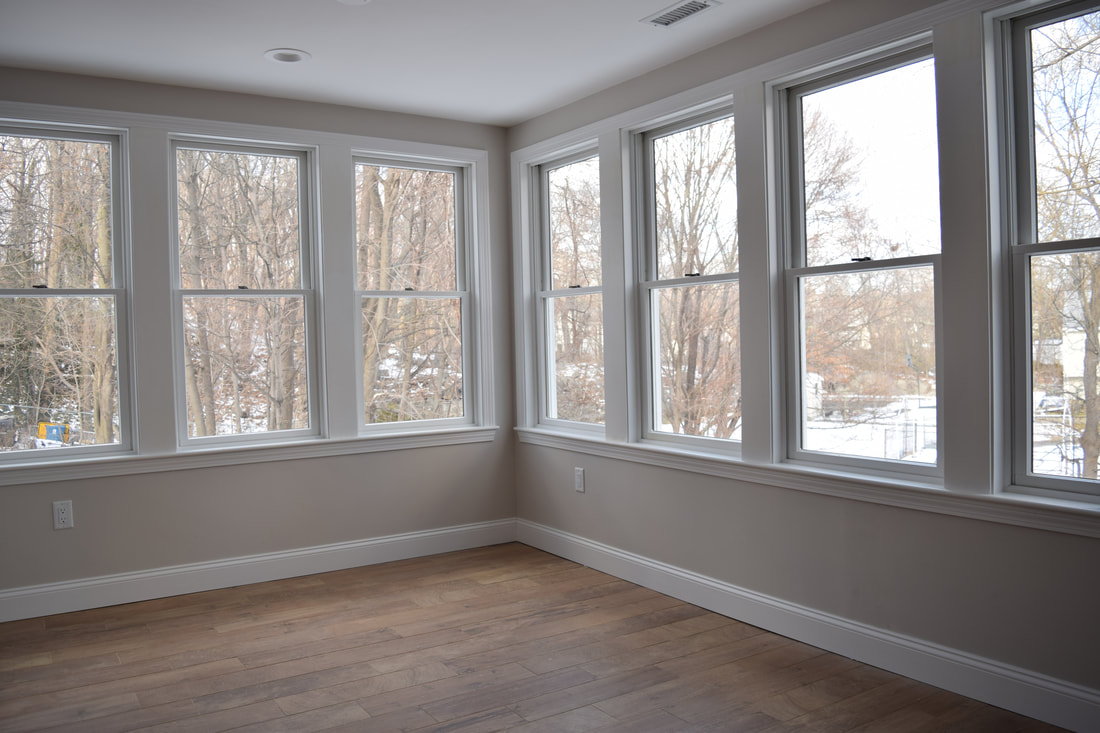
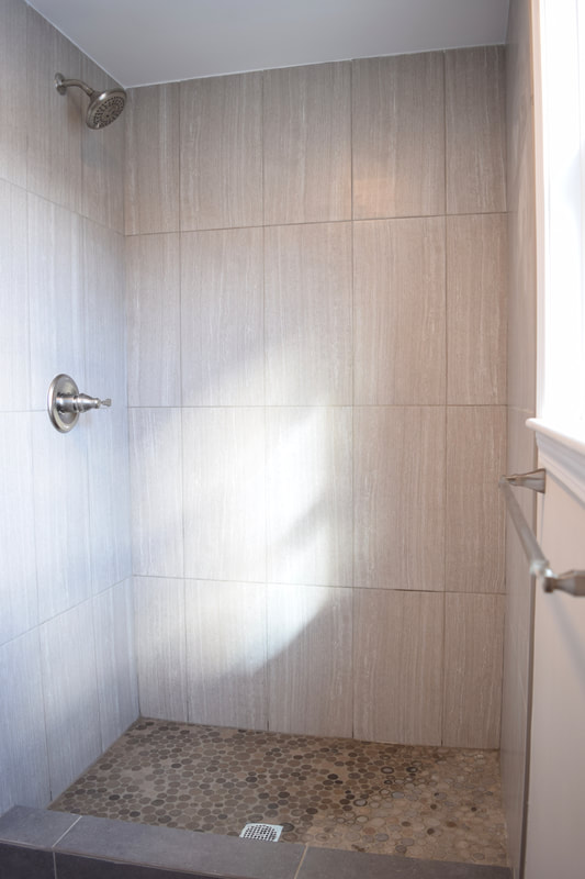
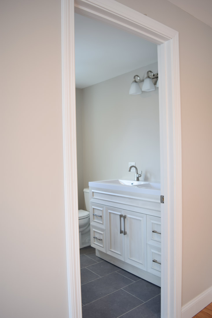
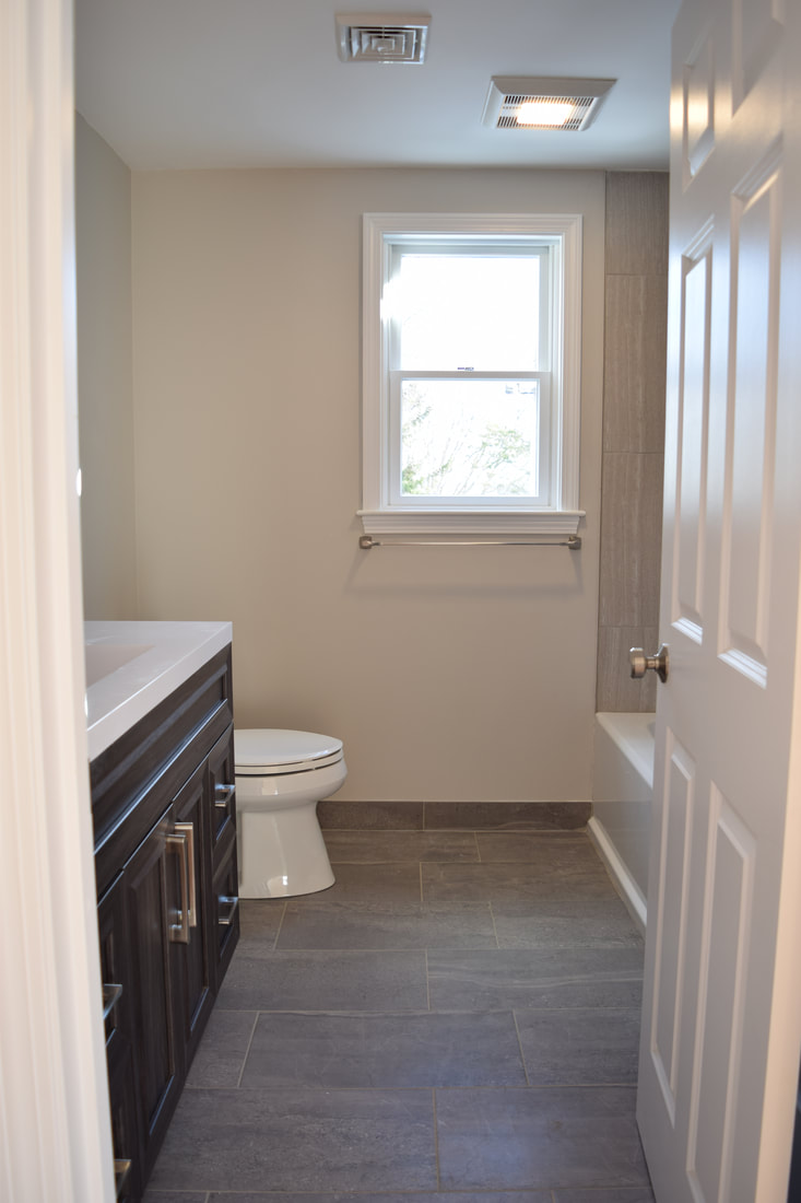
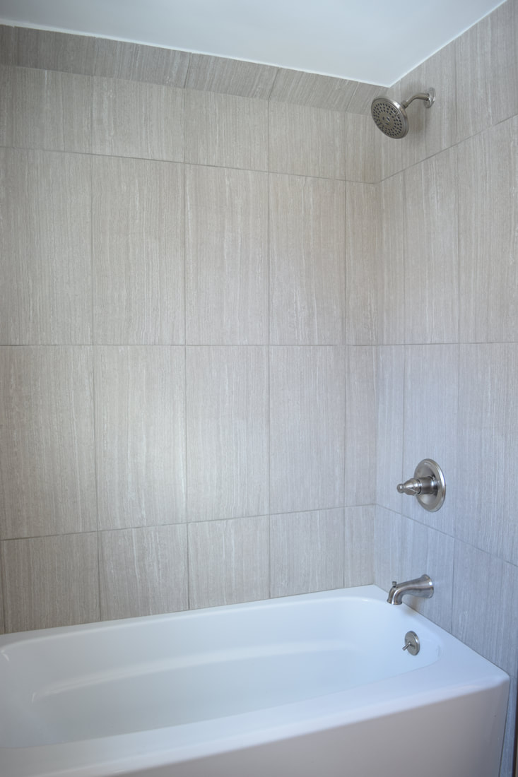
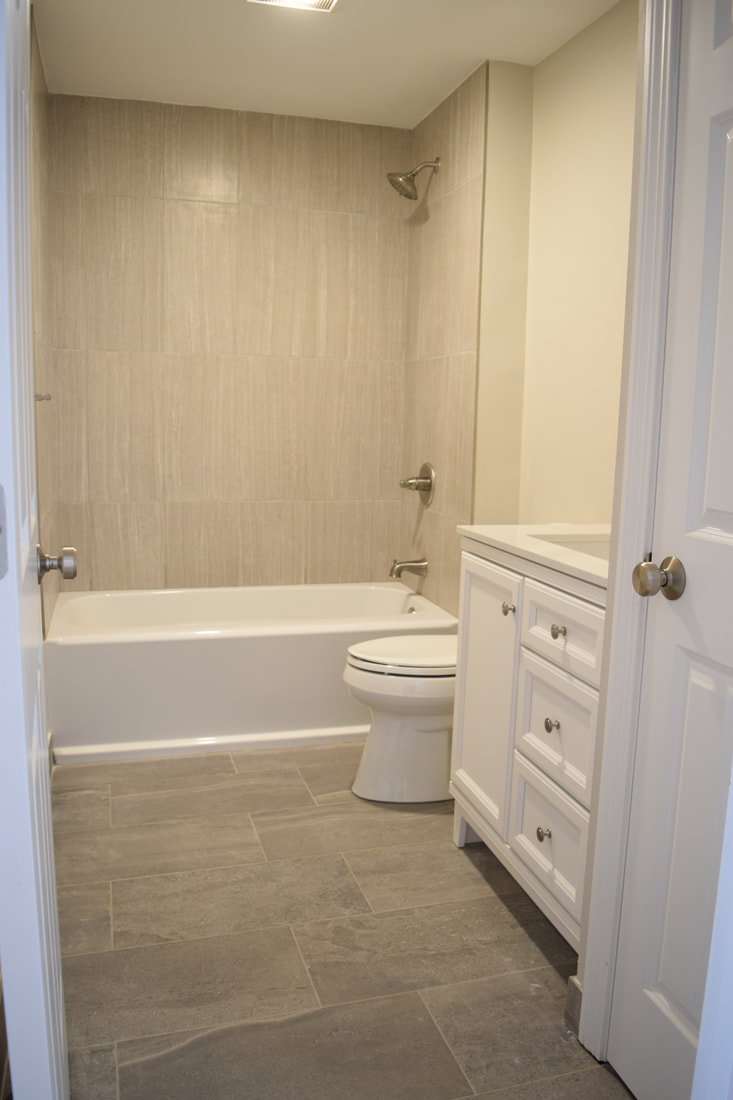
Liz I got to spend my Valentine’s Day with one of my little guys and he came along while I photographed my design work in this beautiful two-story condo unit. I’m so proud to show it off to you! There are some finishing touches needed like errr backsplash BUT that’s construction for you! Always something to wrap up in the final minute. I chose this durable wood-look flooring from Home Depot to complement the red oak flooring throughout instead of carrying the red oak into the kitchen and worrying about having to refinish the floors down the road since it is a rental unit. I just love these floors, they’re just enough rustic to warm up this cool kitchen. Granite countertops and beautiful brushed nickel door knobs and and a Delta faucet round out the charm of this bright kitchen. The three bathrooms all with similar style vanities and the same tile product throughout all sourced at Home Depot of Prosource, Canton. I chose the ceramic flooring in the bathrooms throughout because of the look of granite. To complement the flooring I chose to vertically install the lighter wall tile because of the strong grain mimicking the movement of water. Paired with the round sliced mosaic rock on the shower floor in the master the products give it a spa-like feeling. It’s important for me to keep in mind the “audience” when I’m designing. With this project being a rental unit, I chose products that are lasting and durable. Ceramic and porcelain tile products are durable and easy to clean and brushed nickel is often spot resistant and hides scratches with frequent use. Seal your countertops and tile grout yearly or choose to use the new grout products that are self sealing. If you’re planning to sell your home soon or simply want durable finishes in your products, keep these things in mind and your product investment will go far!
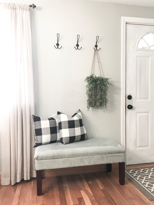
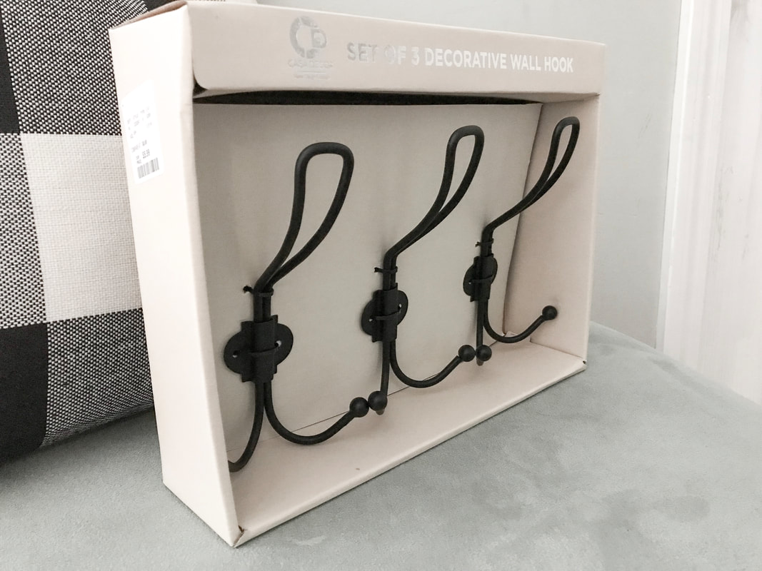
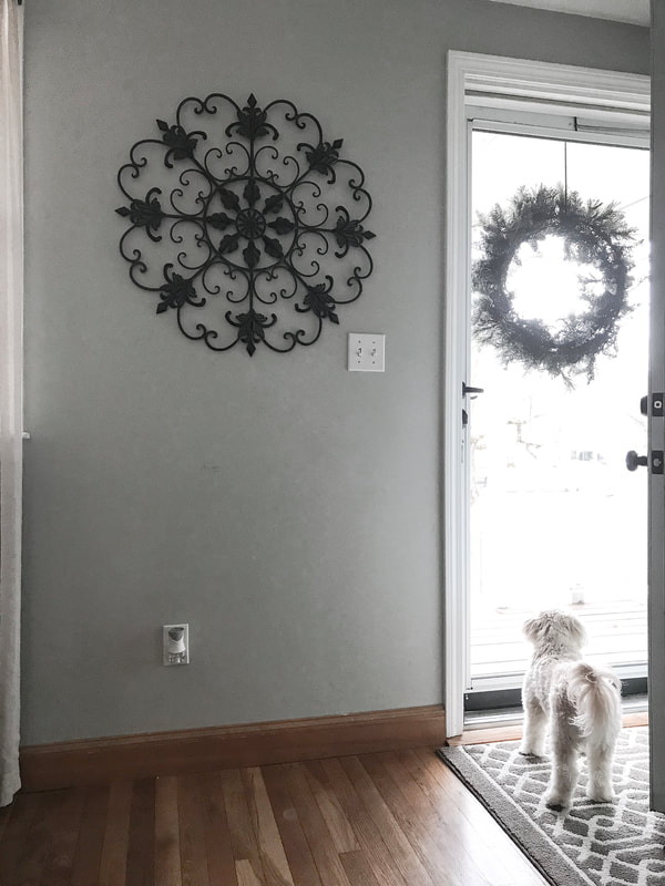
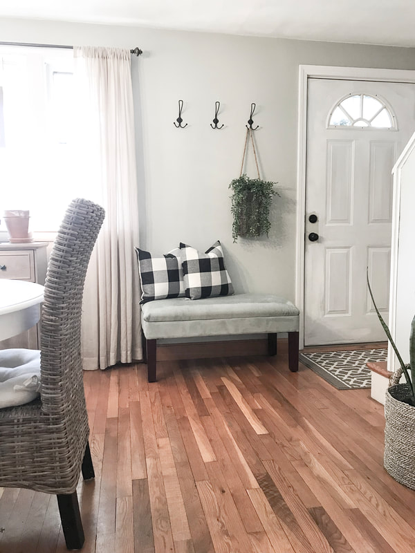
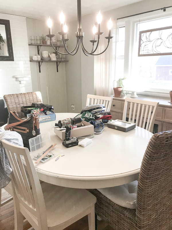
Thanks always for reading, Liz Today I’m bringing you a quick little project that took me less than 30 minutes to pull together and cost only $6.00! Does anyone actually use their front door anymore? We enter through our garage but when we have guests over, they enter through the side door. Unless we have a big party, we rarely use the front door but my hope is if I set it up right, I’ll finally have a welcoming entry guests will actually use! I started with these pretty hooks that were a steal at Homegoods for $5.99 and I had a gift card so technically this entry set up cost me NOTHING! Install your hooks properly with a wood backer or drywall anchors for light use like I did here. Repurposing some “inventory” in my house helped to create a welcoming entry for guests to drop their bags and coats or take off shoes. Pulling this bench down from my master bedroom was the best decision. The only purpose it was serving there was collecting clothing and things I didn’t feel like putting away. Next I moved the pillows from the porch inside now that the wet and snowy weather has arrived and plopped them on this bench and the hanging basket was a Brimfield find. I just love repurposing...check out the “before”. But don’t be fooled by my pretty staged pictures...if I pan over to the left, this is the real life view of my dining room (plus a pretty filter). Just for fun reminding you that those lovely photos folks share on social media likely aren’t their everyday view. Real life = messes. Have fun decorating and making your messy home your own! Bye friends, I’ve gotta go tidy up!
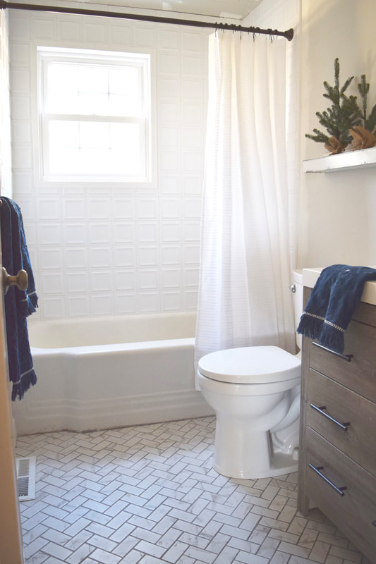
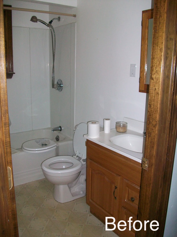
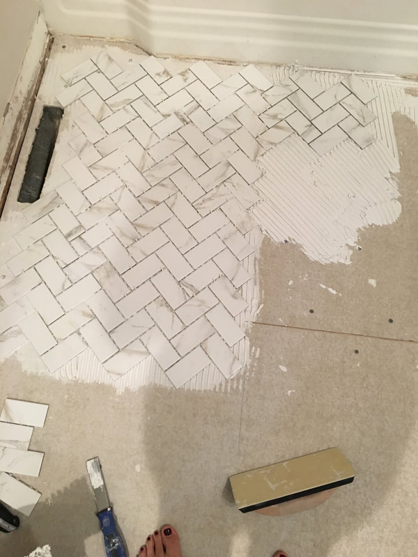
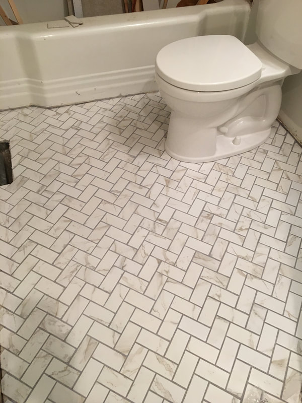
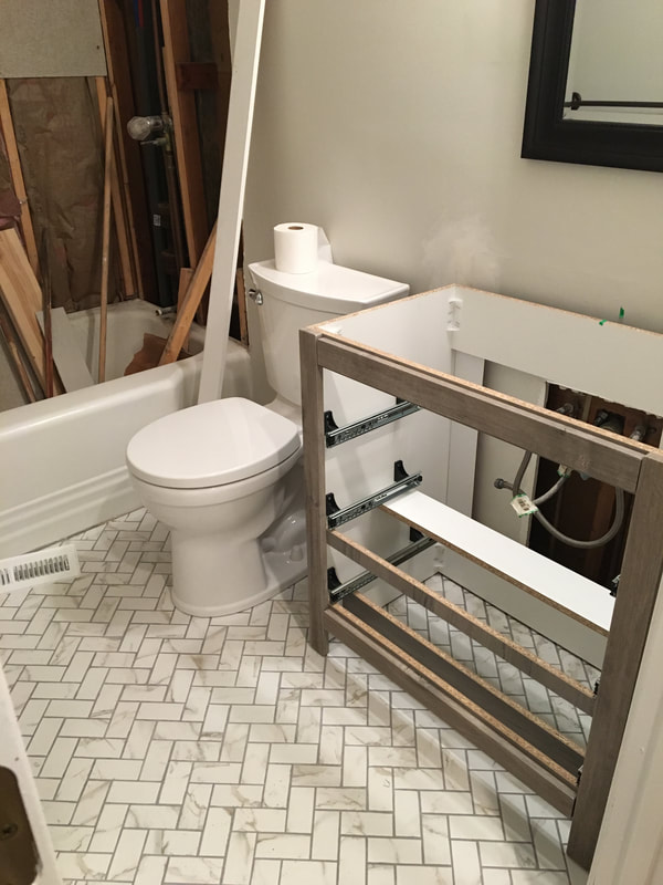
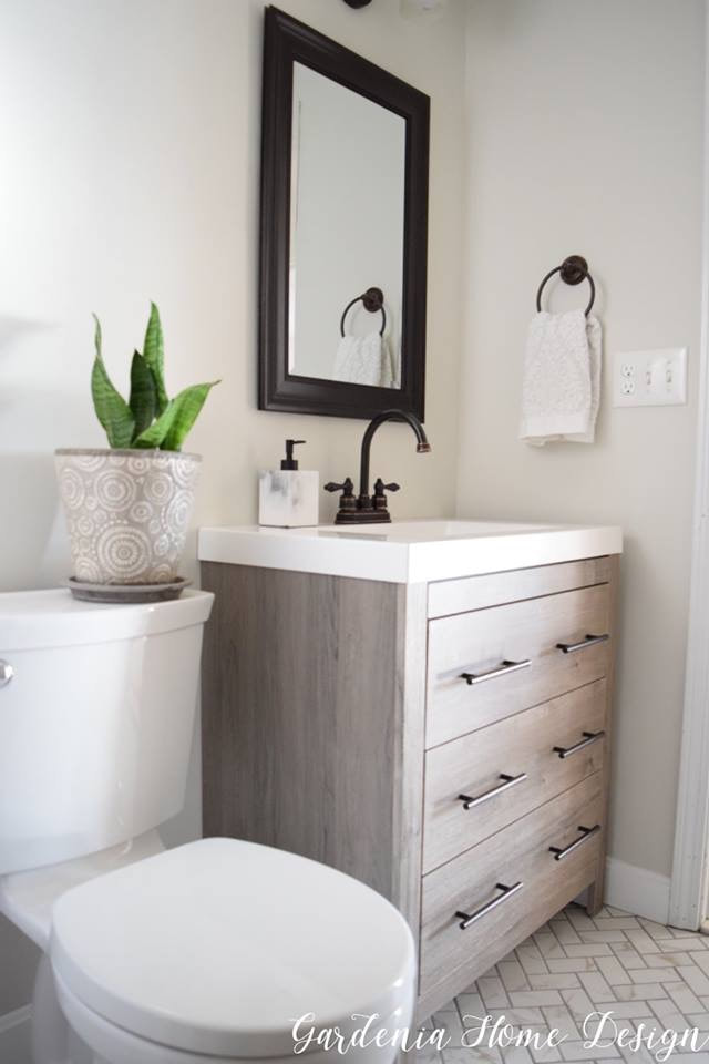
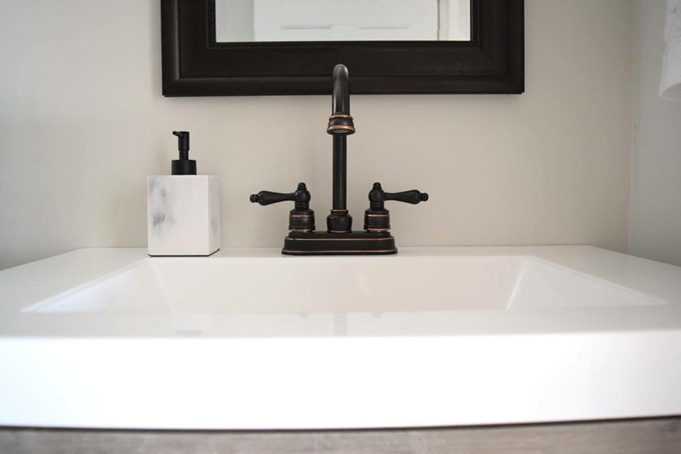
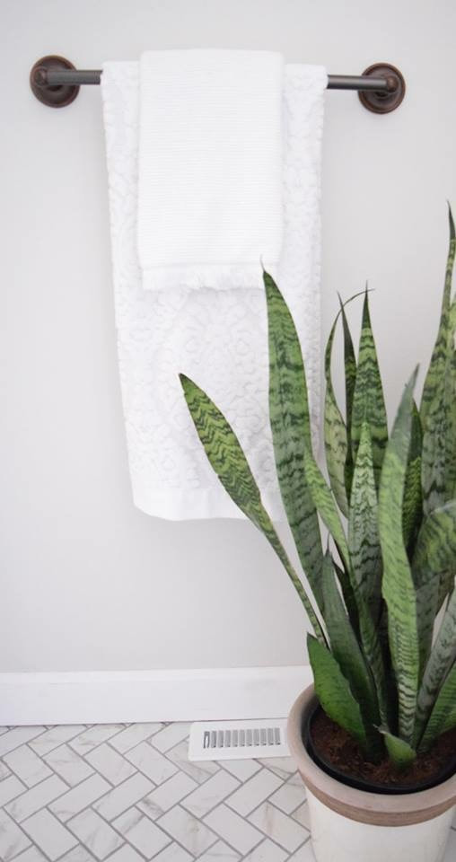
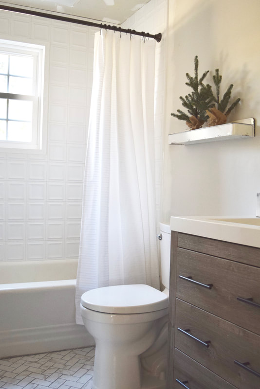
Happy weekend and thank you so much for reading my little blog where I have fun sharing out my decor and design projects. Make sure to sign up on the right by adding your email to my mailing list. Tons of freebies coming to you! Liz This stay-cation, I finally had the chance to chip away at my home projects. I’ve painted, tiled, grout-ed this winter break in between making wonderful holiday memories with my family. Today I’m sharing our guest bath project that is FINALLY (just about) finished. You know how it goes...there’s always some extra little thing to wrap up when it comes to renovating! Below is how this bathroom use to look when we moved in almost 10 years ago. We love this house for the little charming details throughout but from day-one this bathroom was on my demo-list. Nothing charming about about that 80’s vinyl flooring! I spruced up the room over time by painting the old cabinet and adding new hardware and decor but once our other priority projects were complete in our home, it was time to get moving on this bath project. Here are some progress photos once we finished demo. My husband and I decided to gut this room completely last year except for the tub. It’s an original tub from when the home was built in 1950 and seriously keeps in the heat like no other standard tub sold today and I just love the shape and groves in the front bib of the tub nodding to the original era. We installed flooring, vanity, toilet, and tile surround that freshen up this room. The shower tile provides a mid-century appeal keeping true to the original integrity of the home and the flooring and Ben Moore Classic Gray for the wall color keep the room feeling bright, modern, and fresh. The light colors and the tile to the ceiling help this little guest bathroom appear larger. Adding in some sweet details like the navy towels, simple white shower curtain, and rustic elements like the aged enamel shelf help bring in that farmhouse appeal. I hope you find some inspiration here at Gardenia Home Design. Remember that all home projects take time and some projects have to wait. My kitchen for instance will be in hiding from social media and blogs until future notice (hehe) but I’m happy to share my lovely bathrooms and bedrooms! No home is perfect but your home should be a lovely reflection of your and your family. Wishing you a Happy and Healthy 2019!
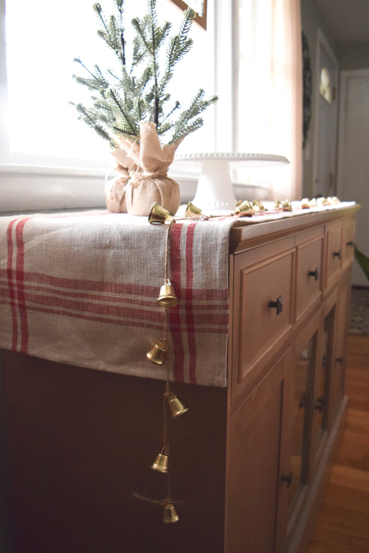
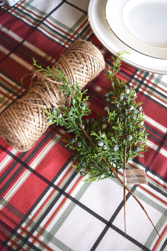
I love all things crafty but I’m a fast-crafter. Anything quick and easy I can whip up that also looks special, I’m game! When it comes to entertaining, I love adding those hand-made touches but these days most of us keep things super simple when hosting parties. The holidays provide a great excuse to get a little fancy, especially when hosting a small crowd for a sit down dinner. Maybe it’s in my blood because my mom always pulled out the cloth napkins, pretty glasses, and dinnerware every holiday when I was a kid. I’d always help stuff the wine glasses with napkins and layer the silverware. Now I continue the tradition and pull out our wedding china and “good” silverware. Though my style is a bit more rustic than my mom’s, I’m thankful she passed on a bit of the fancy gene! Here’s a super simple and easy way to add texture and life to your Christmas dinner table all while getting a tiny-bit fancy. You’ll need:
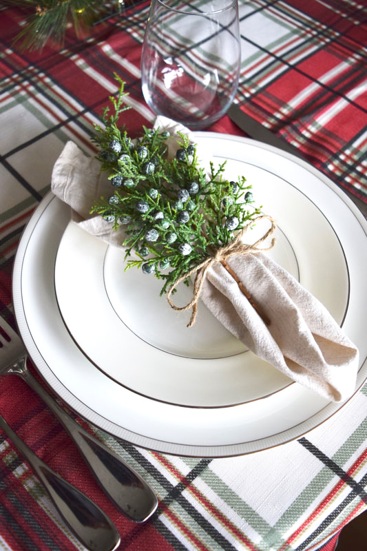
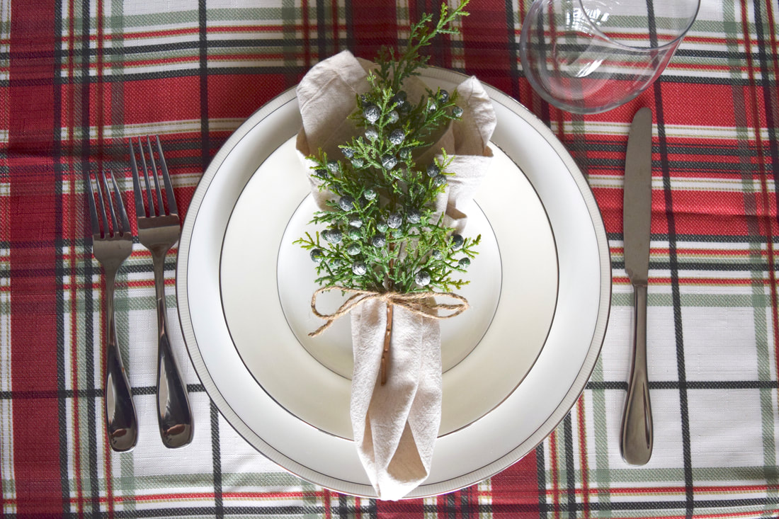
These berry sprigs cost me next to nothing @ $1 each from the craft store and I like that they’re on the larger side and full of green. I recommend having a big spool of twine like this on hand for wrapping gifts, adding tags or bows to jars, and for crafting. This stuff seems to always come in handy. Iron your napkins well to release wrinkles. Next cut a bit at the end of each stem to shorten the length and to remove any exposed wire or unfinished end. Gather your napkin by pinching the middle when flat and picking it up to gather into a simple fan. Tie the middle of the napkin with twine and tuck the stem into the tied twine. Finish the look by adding a bell or place card. I kept it simple here but you could easily add an extra touch by looping it through the twine before tying. You could use fresh cuts of greenery or berries instead, just be careful they don’t get eaten! I like to use artificial so I can use them year after year or reuse for a different project. And if you want to get REAL fancy, Martha has all your napkin folding answers here: https://www.marthastewart.com/1112146/how-to-fold-a-napkin-ways?slide=3410561 Use your china if you have it and definitely layer your plates! Even if you don’t end up using the smaller salad plate it looks so pretty stacked on top of the larger. These bone china plates are from Crate and Barrel circa 2009. Wishing you all a joyous Christmas season and a Blessed New Year. I’m so thankful for you this holiday season, I appreciate you following along! If you haven’t joined the fun yet, please subscribe on the right and join me on my ride as I share my venture in design!
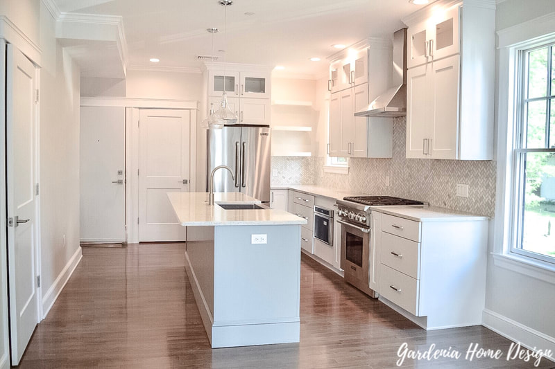
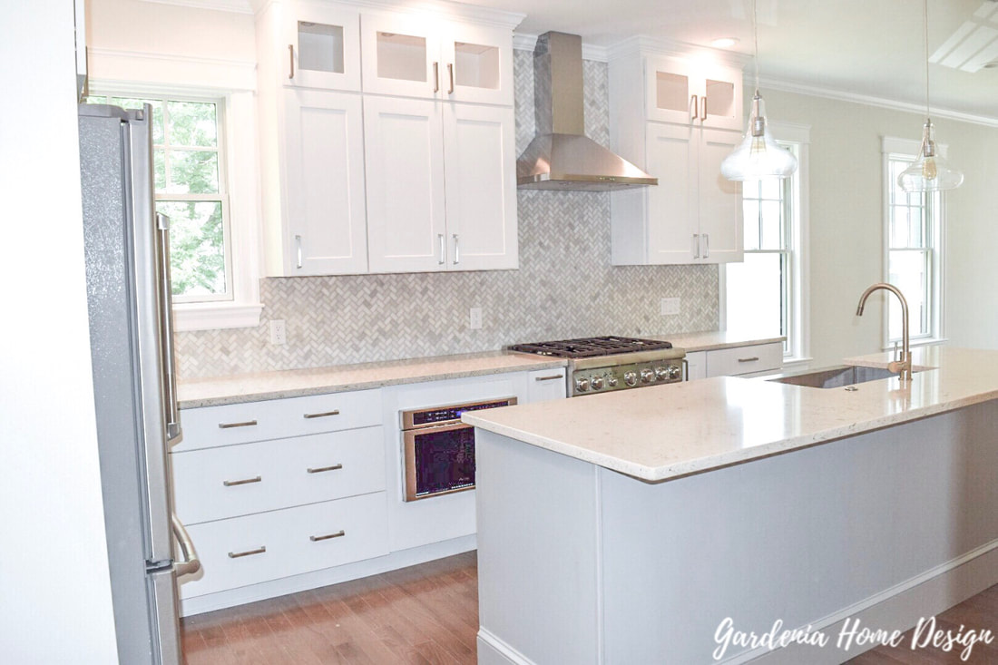
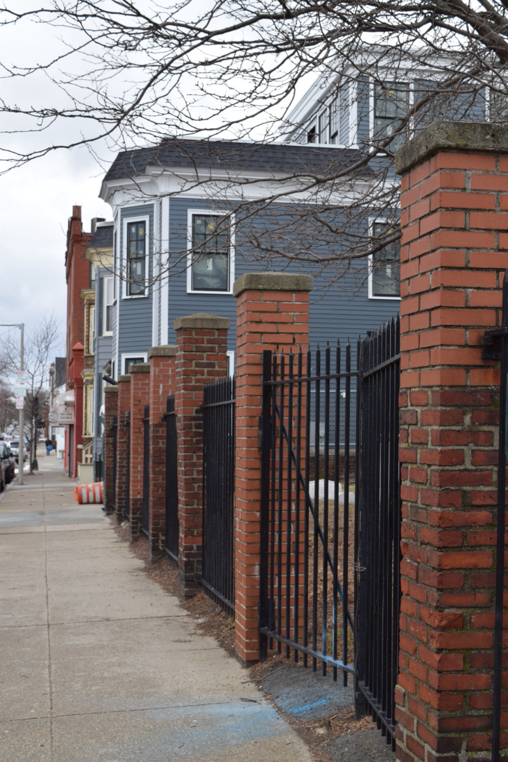
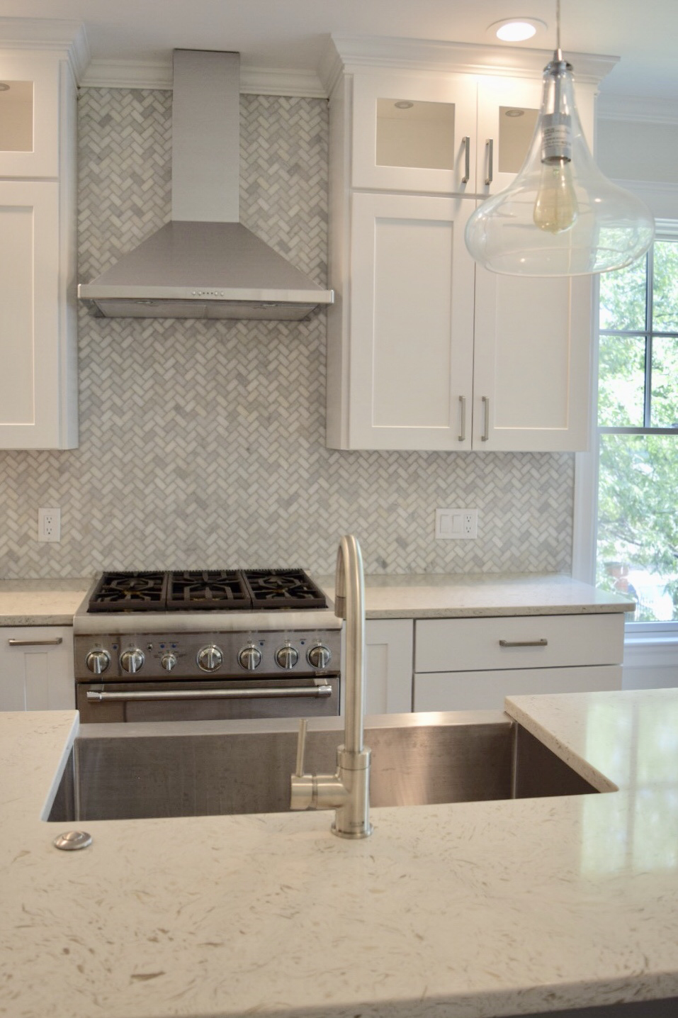
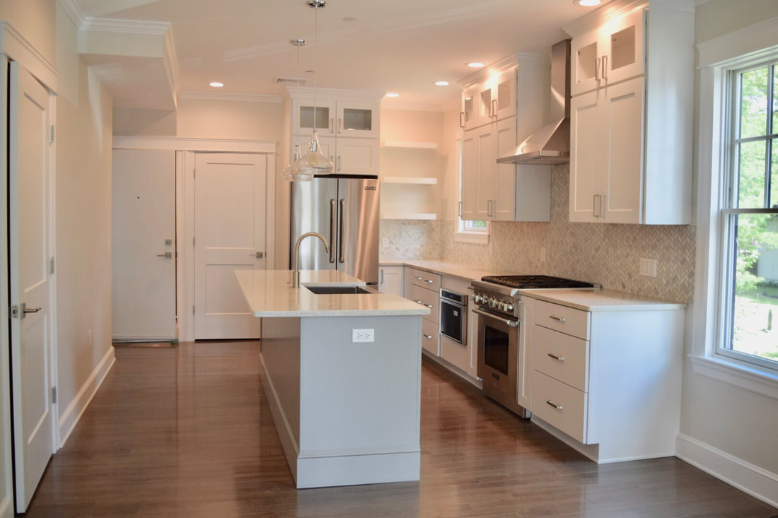
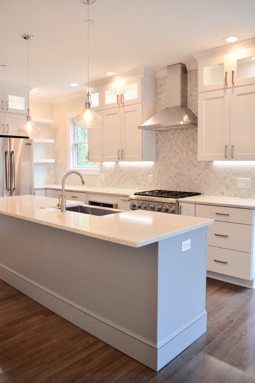
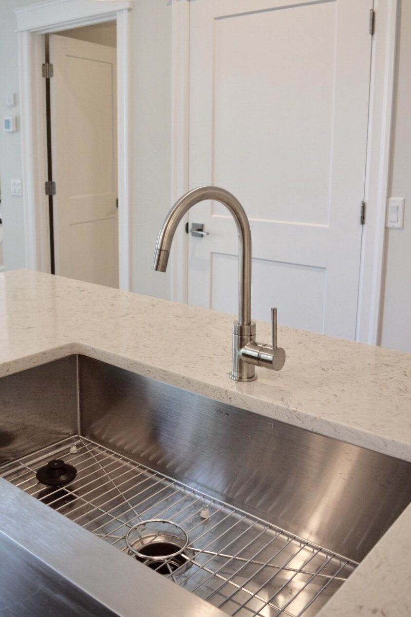
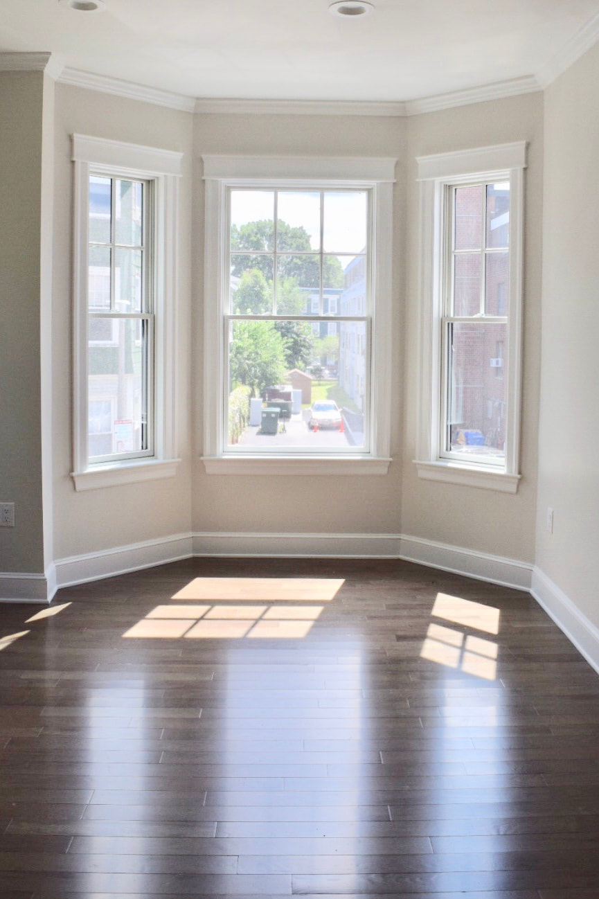
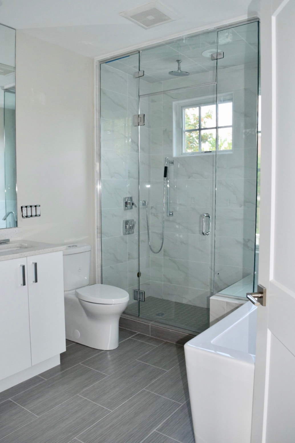
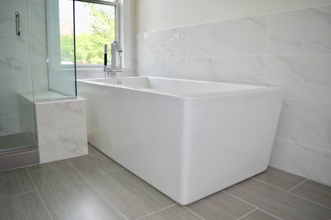
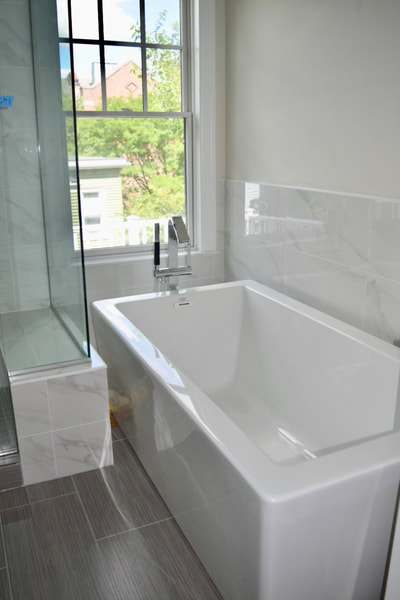
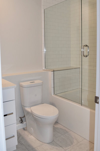
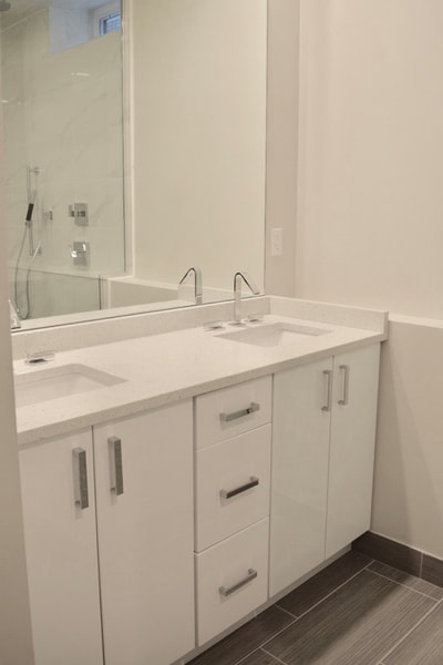
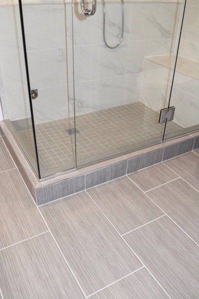
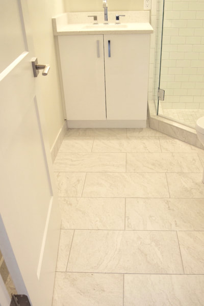
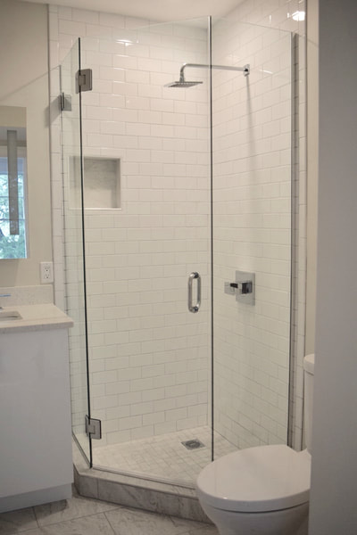
So here we are, it’s final reveal time! When jumping on board this project a few months back, I couldn’t wait to get to this point. The construction team worked hard to convert this old building into something new and beautiful again. This South Boston building was once a multi-family with each one-floor unit on top of the other and in much need of some love. The team started out about 2 years back by demoing and digging deep underground (many permits and city approvals later) in a basement crawl space to reveal a second floor to the lower unit. This project was a bear but these gorgeous identical two-story condos are finally ready for move in and I’m so thankful to have been able to design for this big project. Welcome to the kitchen! The identical kitchens in each condo boast bright white cabinets and cloud gray islands. Gorgeous mini herringbone marble backsplash pairs beautiful with the Penal Quartz countertops in Akoya. For a designer it’s totally normal (right?) to say I’m in love with this brushed nickel Dia faucet from Symmons because it’s so slick and it’s hidden pull down system makes it super cool paired with the top-of-the-line appliances makes for a clean and crisp Cook’s kitchen. I chose this red oak flooring in Smoke to warm up this cool kitchen and highlight some of the subtle warmer colors in the quartz countertops. As for the window trim, I wanted to bring in some traditional aspects true to South Boston while adding some more transitional features like using the wide flat board at the window tops to modernize the look. Complete window envy over here... In the master bathrooms, I chose a beautiful upscale marble-look porcelain product in the steam shower surrounds while more durable and lasting than real marble. My favorite new trend is pairing two very different styles together to create a special design. The gray modern scratch flooring in the master baths works so well with the traditional marble grain in the shower and is a clever pairing that creates such a unique style of its own in these luxurious baths. And how about that TUB?! When designing the additional bathrooms, I wanted to keep them bright and fresh since many of them are quite narrow (typical of city living) providing more living area space. In order to trick the eye into thinking baths are larger, using whites in all the products and bringing the tile all the way up to the ceiling helps give the perception of a larger space.
Finally seeing the design come to life is the best feeling especially knowing these beauties are ready for move-in day and ready to be made into homes. Let me know what you think of the final reveal! As always, thanks for reading! Liz |
AuthorWelcome! Archives
January 2021
Categories |
||||||||
Proudly powered by Weebly





 RSS Feed